Quick intro to flexbox


What is flexbox?
Flexbox is a parent and child relationship. Flexbox layout is activated by declaring
display: flex; or display: inline-flex; on an element which then becomes a
flex container, arranging its children within the space provided and controlling their
layout. The children of this flex container become flex items.
Flexbox works on an axis grid system. we can change the layout of a flexbox items by applying different CSS properties. The flex items can be laid out side by side on a single line, or allowed,
or even forced, to be wrapped onto multiple lines based on the flex containers flex
property values. The main axis in flexbox for web is from left to right or horizontally. But in case of mobile it is top to bottom or vertically.
Example of flexbox
<!DOCTYPE html>
<html lang="en">
<head>
    <meta charset="UTF-8">
    <meta http-equiv="X-UA-Compatible" content="IE=edge">
    <meta name="viewport" content="width=device-width, initial-scale=1.0">
    <title>Flexbox tutorial</title>
 </head>
<body>
    <div class="container">
        <div class="left-section">
            left
        </div>
        <div class="mid-section">
            mid
        </div>
        <div class="right-section">
            right
        </div>
    </div>
</body>
</html>
In this example we are having an HTML file that shows three <div> container. And the CSS code is as follows:
<style>
        .container{
            display: flex;
        }
        .left-section{
            background-color: red;
            width: 100px;
            height: 100px;
            margin-right: 10px;
        }
        .mid-section{
            background-color: yellow;
            width: 100px;
            height: 100px;
            margin-right: 10px;
        }
        .right-section{
            background-color: blue;
            width: 100px;
            height: 100px;
        }
    </style>
The output of the above code is:
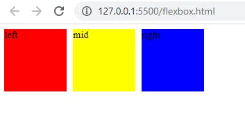
Note that after applying display: flex property the boxes are arranged in horizontal manner. This is the default view for flexbox in web pages for laptop, desktop or bigger screens.
There are many operations we can apply on the inner child containers of parent tag some of them are listed below:
Aligning child containers at middle both vertically and horizontally is very easy in flexbox, you have to just write justify-content: center; and align-items: center; as well. But don't forget to provide the height for the container.
After applying above changes,
.container{
            display: flex;
            height: 100vh;
            justify-content: center;
            align-items: center;
        }
the result we will get is as follows:
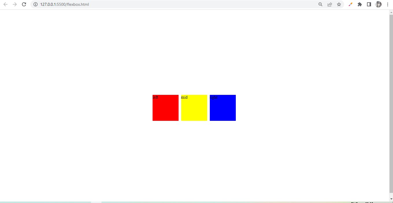
Notice, here we can align children of parent container at the center very easily using flexbox.
Now let's learn how to arrange children of parent container in different manner: first is flex-direction.
As we know by-default the arrangement of child containers in flexbox is row wise, but according to our need we can change it to column as well, look at the example:
.container{
            display: flex;
            height: 100vh;
            justify-content: center;
            align-items: center;
            flex-direction: column;
        }
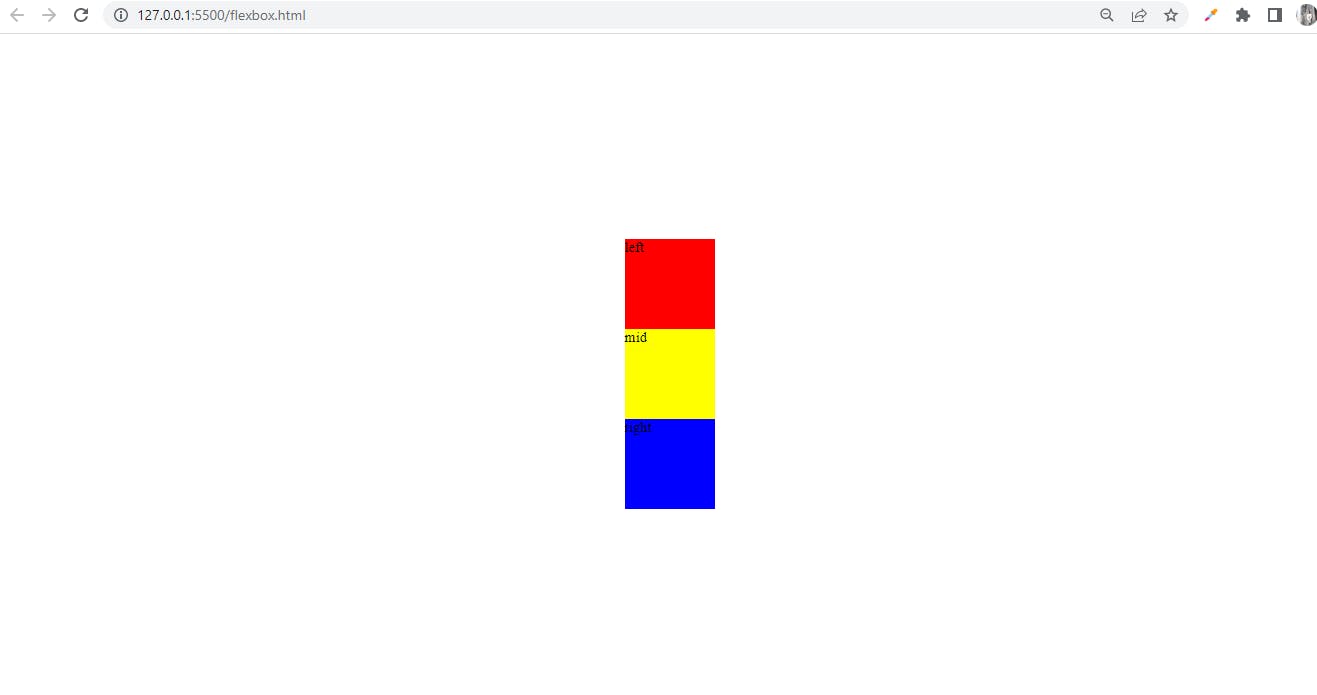
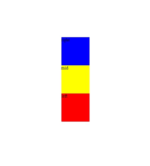
Look at the output, after applying flex-direction: column the child containers are arranged column wise.
We can also reverse the row in flexbox.
.container{
            display: flex;
            height: 100vh;
            justify-content: center;
            align-items: center;
            flex-direction: row-reverse;
        }
and, look at the output:
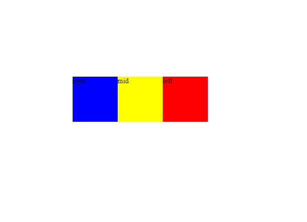
Compare the first output image and the above output image we have reversed the boxes, just by applying
flex-direction: row-reverse;.
We can also reverse the column, by applying flex-direction: column-reverse; look below for ease.
.container{
            display: flex;
            height: 100vh;
            justify-content: center;
            align-items: center;
            flex-direction: column-reverse;
        }
Look we have reversed the column arrangement as well.
These are some of the basic properties which we can use in flexbox. There are many more properties as well. Hope you like this article.